01
Earnings, front and centre
Wallet balance, monthly earnings, and earning-potential rating became the first thing on screen — not a row of badges. The first question users had ("am I making money?") got answered before they had to scroll.

The brief
Lombard had real product–market fit, but a dashboard built outward from launch incentives instead of inward from user intent. Rebuild it around what users actually came for.
Reorganising the dashboard around earnings, portfolio, and personalised recommendations moved every metric that mattered: engagement, retention, and adoption. The biggest shift was diversity — users confidently exploring new positions because they finally had the context to evaluate them.
Lombard had pulled off something rare in DeFi: real product–market fit. LBTC was minting, TVL was climbing, and the team had built a credible moat around Bitcoin liquid staking. The dashboard, though, hadn't kept up with the product behind it.
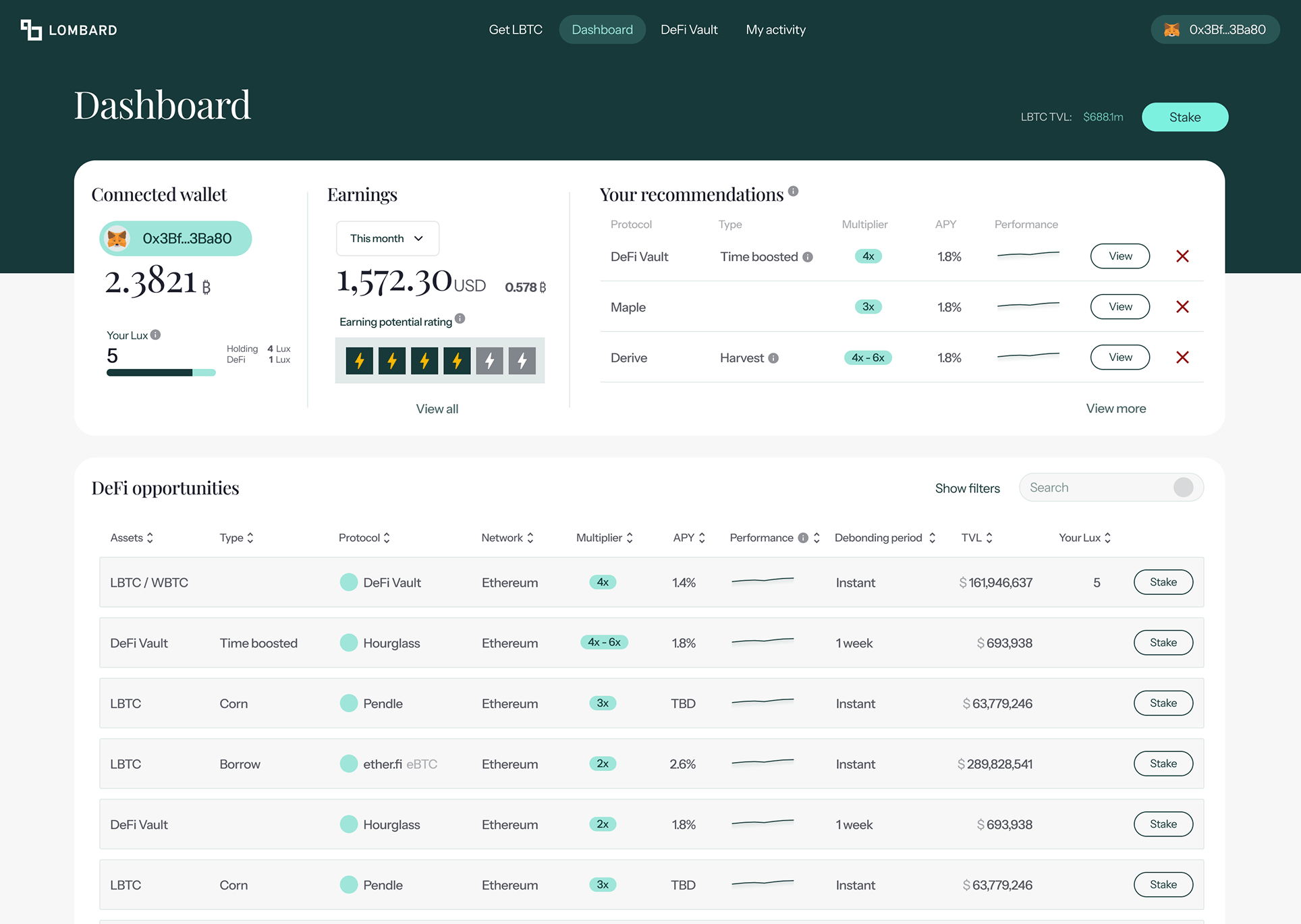
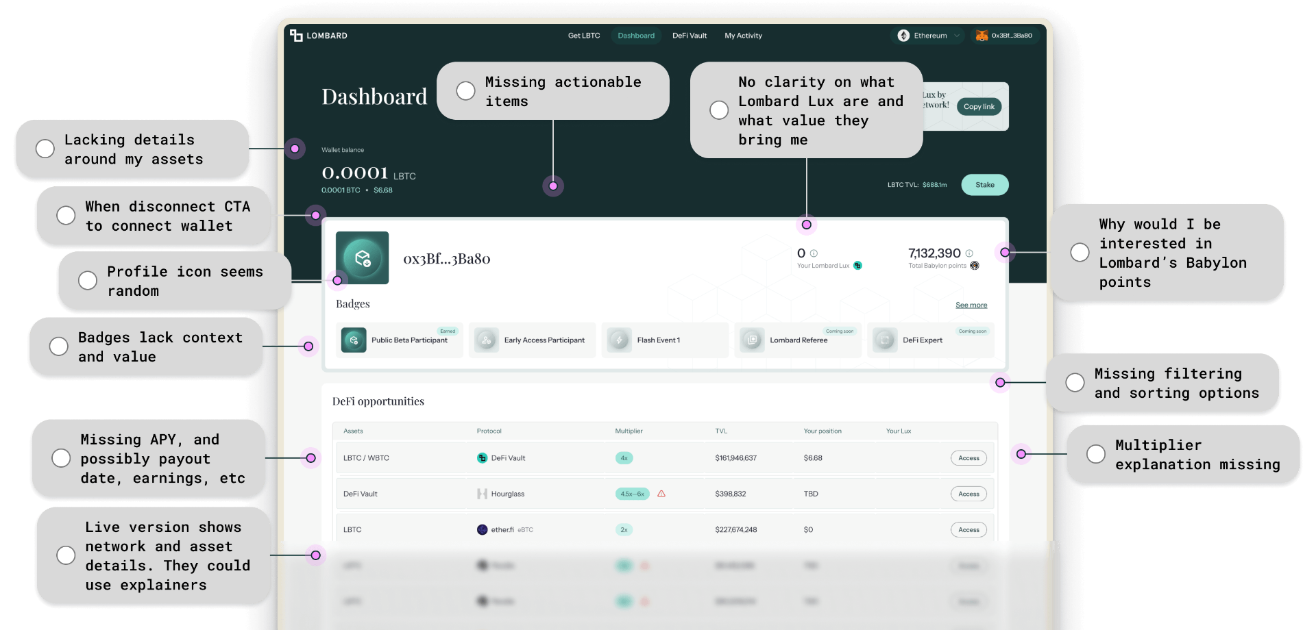
The first time I opened it, four different incentive systems competed for attention before I could find my actual wallet balance and portfolio: Lux, Babylon points, badges, referrals. Users were thrown in the deep end — no explanations, no way to filter or sort the (unwanted) opportunities, and no view of what they had already staked or what it was earning.
The hypothesis going in: the dashboard had been built outward from launch incentives rather than inward from user intent. It answered "what is new at Lombard?" before it answered "what's happening with my money?"
Before any data, four hypotheses framed what the redesign needed to prove — each one a bet about what the dashboard had been hiding.
APY and earnings belong above the fold, not buried below opportunity tables.
The unstaking window is a top-three decision factor, yet it was nowhere on screen.
Network, contract, history — none of it should require a five-tab expedition.
First-time visitors and seasoned stakers do not need the same view.
Three sources, one finding. Competitive teardowns of Lorenzo and Bedrock showed both were doing one thing Lombard wasn't: orienting users — explaining points systems and recommending specific opportunities based on holdings.
On-chain data from Nansen reframed the audience. The top LBTC segments over six months were Heavy DEX Traders, Token Millionaires, and DEX Traders — sophisticated, fee-sensitive, comparing across protocols. Not the audience you delight with badges.
User interviews said the same thing in different vocabularies: missing APY, missing risk classification, missing debonding periods, missing guidance. Three sources, one brief — clarity over gamification.
Wallet balance, monthly earnings, and earning-potential rating became the first thing on screen — not a row of badges. The first question users had ("am I making money?") got answered before they had to scroll.
The opportunity table was reframed as "Your recommendations" — three personalised options, sortable, with a clear secondary path to view all. The shift from "here is everything" to "here is what fits you" did most of the heavy lifting on engagement.
APY, performance trend, debonding period, multiplier, and Lux per row. Filterable. Sortable. Verifiable. The columns Heavy DEX Traders and Token Millionaires actually wanted — not a curated wall.
Badges, points, and referrals didn't disappear. They moved lower down the dashboard and surfaced contextually — where they had earned the user's attention, not demanded it.
The biggest movement was diversity: users staking across more opportunities. That is the metric I cared about most. It says people weren't just doing more of what they already understood — they were confidently exploring new positions because the dashboard finally gave them the context to evaluate them.
Users didn't have to learn a new dashboard.They finally had one that learned them.
Reorganising the surface around earnings, recommendations, and decision-grade data moved every metric that mattered — and shifted behaviour, not just clicks.
Engagement, retention, and adoption all moved together: staking diversity +86%, staking amount +18%, staking duration +71%, user count +16%.
Users staked across more opportunities — exploring new positions with the context to evaluate them.
Total staked volume rose as earnings and portfolio took priority over incentive noise.